There are basically three different ways to specify tooltips. The first is to just set the Tooltip property on the control where the tooltip should appear. You set the property to the text that you want to see in the tooltip.
        <Button Content="Read a Book"
                Padding="10,5" HorizontalAlignment="Center"
                ToolTip="You might start with Charles Dickens"/>
Image may be NSFW.
Clik here to view.
If you want to create a more complex tooltip, you can use the property element syntax.
        <Button Content="Read a Book"
                Padding="10,5" HorizontalAlignment="Center">
            <Button.ToolTip>
                <StackPanel>
                    <TextBlock Text="Reading Suggestion" FontWeight="Bold"/>
                    <TextBlock Text="Charles Dickens" Margin="5"/>
                </StackPanel>
            </Button.ToolTip>
        </Button>
Image may be NSFW.
Clik here to view.
Finally, if you want to specify property values for the ToolTip, you can use a ToolTip element.
        <Button Content="Read a Book"
                    Padding="10,5" HorizontalAlignment="Center">
            <Button.ToolTip>
                <ToolTip Foreground="Blue">
                    <StackPanel>
                        <TextBlock Text="Reading Suggestion" FontWeight="Bold"/>
                        <TextBlock Text="Charles Dickens" Margin="5"/>
                    </StackPanel>
                </ToolTip>
            </Button.ToolTip>
        </Button>
Image may be NSFW.
Clik here to view.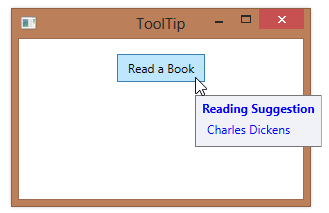
Filed under: Controls Tagged: Controls, Tooltip, WPF Image may be NSFW.
Clik here to view.
 Image may be NSFW.
Clik here to view.

